Saturday, 8 October 2011

Editorials to Inspire

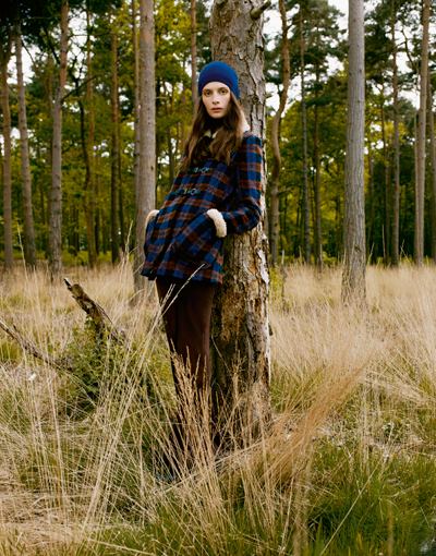
I found this editorial in Vogue, November 2010, called My Own Private Idaho...its stunning! And I know its not shot in Britain but it could be! Its just creates the sense that she's living out in the woods all by herself, enjoying her freedom and enjoying nature, its a beautiful story...


Although the coloured images are amazing, I also want to create some black and white ones, they're so effective!

Here is another one I found in a Vogue insert shot by Guy Aroch....


I chose this one because the beautiful summer haze puts you in a trance! It has a gorgeous glow, and the colours are slightly muted almost. I like how the background is blurred, it add to the slow, relaxed feel.

Here are a bunch of found images that I like the look of.....


Haper's Bazaar August 08


i-D Fall 2010


Whistles


Muse Summer 2008

Moving Forward

After my research into other brands, I have decided that I would like to create my own story board and create a magazine to promote my brand.

The brand represents a confident, smart, working woman who is 35+ and is looking for something that represents quality and luxury. The clothes will be softly tailored and the brand will also offer a bepoke tailoring service. The brand will also have an accessories and possibly homeware's line which will also be promoted through the magazine.

I am not entirely sure what I want from the photoshoot yet, but I want it to have a touch of British. I want it to look quite natural too and not too posed, I think thats something that most middle aged women want to see, natural beauty. I would also like the magazine to incorporate a feature, maybe a design collaboration, or an inspirational story....

I have no name yet, so I will get to work on that!

Reiss Lifestyle

Reiss is another company that have taken advantage of doing something more for their customers than just their clothes and that is the Lifestlye section on the website. They use every opportunity to promote the brand. The first section is Reiss at 40 which celebrates and looks back on the brand that is 40 years old. They have a magazine to promote their clothes, a blog to keep Reiss fans up to date, and a celebrity spy section because everybody loves to see a celebrity in a brand that they wear. They also have Reiss live- facebook and twitter, and store design ensuring that customers know where to find Reiss! They haven't missed a thing!

Whistles Campaign

This seasons Whistles campaign is really nice, they have created a photoshoot using two different backgrounds, I liked the more natural, earthy, woodland one. Its quite simply about the location and the outfits, which go really well together....


I also like the Features section on the website which has a story promoting a trend or an event. The current feature is probably my favourite. It focusses on this seasons coats, and instead of using photos, they have used illustrations instead.....


Friday, 7 October 2011

Ad Campaigns

Looking through my huge pile of magazines, I found a few gorgeous ad campaigns that I thought might apply to my concept....


I found this image in a Harper's Bazaar 2008 magazine, and it really stood out: the styling, the photography, the pose, but in a very subtle way, it all works well together. So this prompted me to have a look at the rest of the campaign which was just as good! Its sensual, natural and beautiful, its definitely editorial quality! Here's more....


Another a/w ad campaign shot by Peter Lindbergh for Gerard Darel also caught my eye in Harper's Bazaar September 2011...


Everything looks so natural and unposed! Gerard Darel has used Robin Wright to model, who is mid-aged and looks amazing, when flicking through the magazines I didn't notice her age, she fit right in with the other ads and younger models! 

The other images which I found on the net are also beautifully natural. The black and white is also a nice touch. It always stands out and ...

Urban Outfitters: A/W Story

I came across the Urban Outfitters Winter 2010 catalogue which is great. Just like the Toast catalogue, they have created their own story, and although it is targeted at a younger customer, its very strong, they know who their customer is and what they want. The catalogue has a small section in the middle with features including: designer collaboration, music, promoting a new store and a winter survival guide. They are constantly promoting the brand whilst appealing to their customers.

Anyway, here is a look at the catalogue, the images are great, but I also like the pages in between that focus on homeware, accessories and clothes.....


Beautiful Stories

I have decided to create a photoshoot to promote my brand, and continuing with the theme of British heritage, I want it to be British inspired. I don't want it to look too cliche, but I still want it to have a hearty, nostalgic feel.

So here is more inspiration...


These images from Toast are beautiful, they are from the autumn/winter 08 catalogue, so are fairly old, but this country, farm, nature feel is something that they have continued to focus on throughout their ad campaigns, and they do it so well. The current catalogue is even more stunning and I love how it has images of scenery, colours and textures, its so nice to see something more than just clothes. It creates a visual story and shows the brands personality.....


Another company that is on a similar page to Toast, is Anthropologie, which has also got some nice imagery in Autumn 2011 catalogue. The fashion shoot is probably not as strong due to some of the catalogue posing! Also I really think they should be making the most of targeting to an older market, but other than that, some beautiful images.....